


|
|
|
|
So the design is up to you. ALE just helps you achieve it.
The topics in this section include:
ALE offers you three general options for laying out components in your dialog:
Let's look at each method separately.
Grids are quite simply defined:
Components are defined within the grid individually. Each component has its own width, height, X point, Y point, and alignment. Components are not required to be the same size or have the same alignment. The grid merely acts like a table, and each table cell's contents (the component) can be different.
Where are good places to use grids? When you want a console or panel of several buttons that are uniformly placed in rows and columns (e.g., if you wanted to emulate a CD or tape deck console).
Flows are defined in this way:
Good places to use flows are when you have a single column or row of components that are placed one after the other, those components are different sizes, and the column or row should be sized relative to another object.
In our xv example in A Real World ALE File, flows are used liberally to handle rows and columns of buttons that should be aligned and sized relative to other objects. For example, xv has a large listbox which has to its right a column of buttons that are sized to run exactly from the top to the bottom of the listbox. Rather than lay out each button individually, flow allows you to define the flow attributes, define and size one button, and then define the other buttons. Flow automatically handles the rest of the layout.
The free form design allows you to define and position components individually.
Generally speaking, any component definition outside a flow or grid is free form.
If you've already skipped to A Real World ALE File, you've seen the many ways in which component size and position attributes can be defined.
In general, component size and position can be defined:
Defining a component in absolute pixels has the advantage, as well as the disadvantage, that it will never deviate from its size or position no matter how the dialog is resized.
Before outlining the many ways that a component can be defined, it may be useful to review the variables used by ALE:
You'll probably use a combination of layout methods when you create your interface, simply because interfaces are rarely so simple that a grid or single column of components will do. ALE allows you to use as many of these methods as you like in each section of your ALE file.
grid(rows, columns, xmin, ymin, xmax, ymax)
flow(direction, start point, end point, opposing direction centerline)
Defining component attributes
Note: If you define components using absolute values, it may be best to prevent a user's resizing the dialog. If you allow the dialog to be resized, all of the components will congregate in the top left corner of the dialog when the window is dragged larger, leaving blank space to the right and bottom.
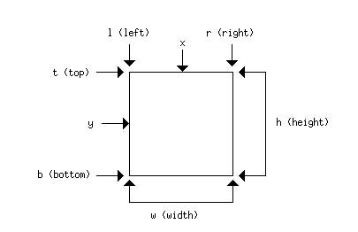
The variables may be used to refer to either the parent container or the components (e.g., w is the dialog's width, and component.w is the component's width. In general, if the variable is not preceeded by the name of a component, it refers to the parent container for each section. You may also refer to the parent component explicitly as in: "parent.w". Also, a component may refer to itself by prepending "this" to an attribute. If your component is called "button1" then "button.w" and "this.w" both refer to the width of the same component, button1.
These variables are used liberally in ALE, whether aligning or sizing the components.
Every component has an X,Y position.
The alignment setting you choose determines how the component is aligned around the X,Y point.
Components' X,Y points can be relative to other components, or relative to the parent container itself.
If you want a component to be aligned in the top left corner of the dialog, with 1 pixel between the top and left edges of the dialog and the component:
If you want a new component to be aligned in Y with an old component and flush with an old component's right side:
If you want a new component to be aligned in Y with an old component and placed one pixel to its right:
Components can be sized:
If you want the component to be same size as another component, you can specify this using:
Let's say you want a component to be one-fourth of the complete width of dialog in which it resides. It can be done in the following ways:
or
component(parent.w / 4, height, X, Y, alignment) -- Use the parent.w variable to refer to the entire width of the parent and divide by 4.
You can define multiple components to be used together. For example, the components on this scanner software dialog are defined individually, but then a container contains the components:
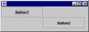
Note: The advantage to using relative values rather than absolute values is that if the dialog is resized by the user, the component will be resized to fit the dialog.
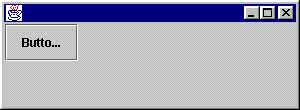
Note: The button label in this screen shot is abbreviated because the label is longer than the button itself. The button size is determined here by the size of the dialog, which is set in the Java code using setSize(). If the button's size had been chosen to accommodate the label and had been specified in absolute values, then the label would fit the button, but the button would not stretch or contract based on the dialog's size.
Using multiple components
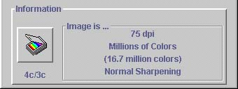
The ALE entry that creates the above example is:
// "Image is..." section with four labels
section imagePanel
{
flow(VERTICAL, .1 * h, .9 * h, w / 2)
{
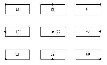
imageLabel1(p, p, 0, 0, CC)
imageLabel2(p, p, 0, 0, CC)
imageLabel3(p, p, 0, 0, CC)
imageLabel4(p, p, 0, 0, CC)
}
}
// "Information" panel containing the imagePanel,
// the scan icon, and the scan label
section infoPanel
{
scan (w / 6, this.w, 10, h / 2, LC)
scanLabel (p, p, scan.x, (h + scan.b) / 2, CC)
imagePanel(3 * w / 4, .75 * h, w - 5, h - 5, RB)
}
Note here that the section called imagePanel is included in the section called infoPanel.
You can define multiple dialogs within the same ALE file since each dialog is, in fact, a "container". Simply give each dialog a separate section, and in your Java code, specify the individual sections as needed.
If the interfaces are complex, you may find it easier to create an ALE file for each dialog.